
How to Design a Website with Typography design in Mind
Typography is an integral part of web design, and it can have a dramatic impact on how your website looks and performs.
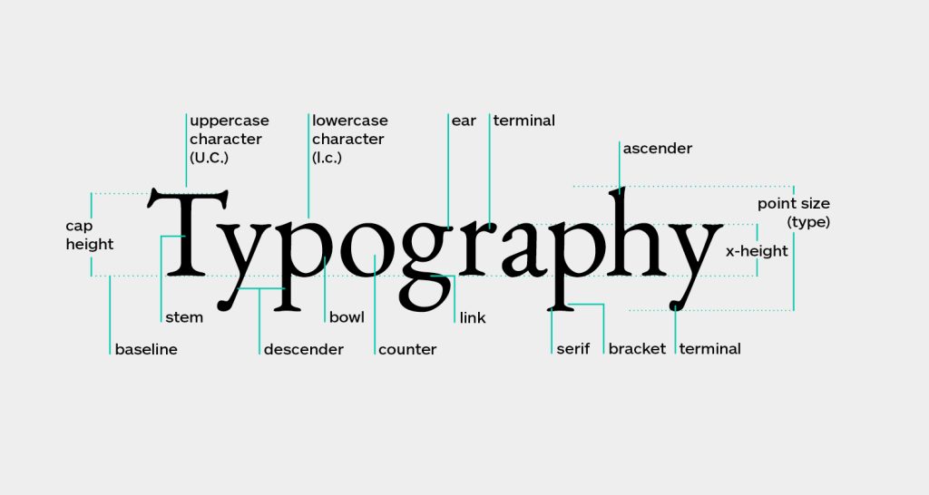
By understanding the basics of typography and incorporating them into your design, you can create a website that’s both visually stunning and easy to use.
In this article, we’ll discuss the best practices for designing with typography in mind, so you can create a unique website that stands out from the competition.
Don’t Use Too Many Fonts
Using too many different fonts on your website can be distracting and overwhelming for users.
The best practice is to limit yourself to no more than two or three fonts, with one main font that’s used for body text and a second font that’s used for headlines or titles.
Stick With Web-Safe Fonts
The best way to ensure consistent typography across all browsers is to stick with web-safe fonts. These are fonts that are pre-installed in most operating systems, so you don’t have to worry about downloading extra files or embedding them into your website.
This also makes it easy for visitors who don’t have the same font installed on their computer as you do. Popular web-safe fonts include Arial, Times New Roman, and Verdana.
Typography design
Consider Line Length
When it comes to typography, it’s important to consider line length as well as font size. The ideal line length for easy reading is between 50-75 characters per line.
This allows the reader to easily scan the text without getting lost or overwhelmed.
You can adjust the line length of your text by adjusting the width of your content area or by increasing or decreasing the font size accordingly.
Pay Attention To Color And Contrast
The use of color and contrast can have a huge impact on how readable your website is. When choosing typefaces and colors, make sure you’re using high-contrast combinations that are easy to read.
Stick with darker backgrounds with lighter-colored fonts, or lighter backgrounds with darker-colored fonts.
Also, avoid using colors that are too similar in hue and value, as this can make it difficult to distinguish between different elements on the page. Lastly, make sure you’re not using garish colors that could be off-putting to readers.
Test On Different Devices
It’s important to test your website on multiple devices and browsers to ensure that your typography looks good everywhere. This includes mobile devices, where font sizes may need to be adjusted accordingly.
By testing your site across multiple platforms, you can make sure that all of your typography is flawless no matter how users are accessing your site.
Avoid Blinking Text
Blinking text can be very distracting and off-putting to readers, so it’s best to avoid this altogether.
If you need to draw attention to something on your website, there are other more subtle methods that will be much less jarring for users.
Contact Us for Web Design Help
If you need help designing your website with typography in mind, get in touch with a web design professional.
We specialize in creating unique and functional websites for small businesses. Our experienced web designers will work closely with you to create a website that stands out from the competition. Contact us today for more information.


